Working Kitchen
I’ve shown you my workspace and how I spend my day, but since we renovated our kitchen in January, I haven’t given you the full tour or any specific details. I thought it might be fun to see how things have changed since we moved in almost seven years ago.
When we bought the house at the end of 2005, Ryan spent his entire Christmas vacation painting most of the rooms, and it was truly a labor of love. I was working a lot back then, and I helped as much as I could, mostly by bringing dinner over after work. It took him about two weeks to paint the kitchen, guest bedroom, guest bathroom, and our master bath. I was so incredibly proud of his efforts, but he vowed never to paint again.
So, when we decided to change our flooring and redo the kitchen, we hired a local company that specializes in home renovation and literally does it all, from painting to flooring to cabinet installation. It was a long process and took lots of coordination, both on our part and SHI’s, but we are completely thrilled with their work, and our house is beautiful and feels brand new.
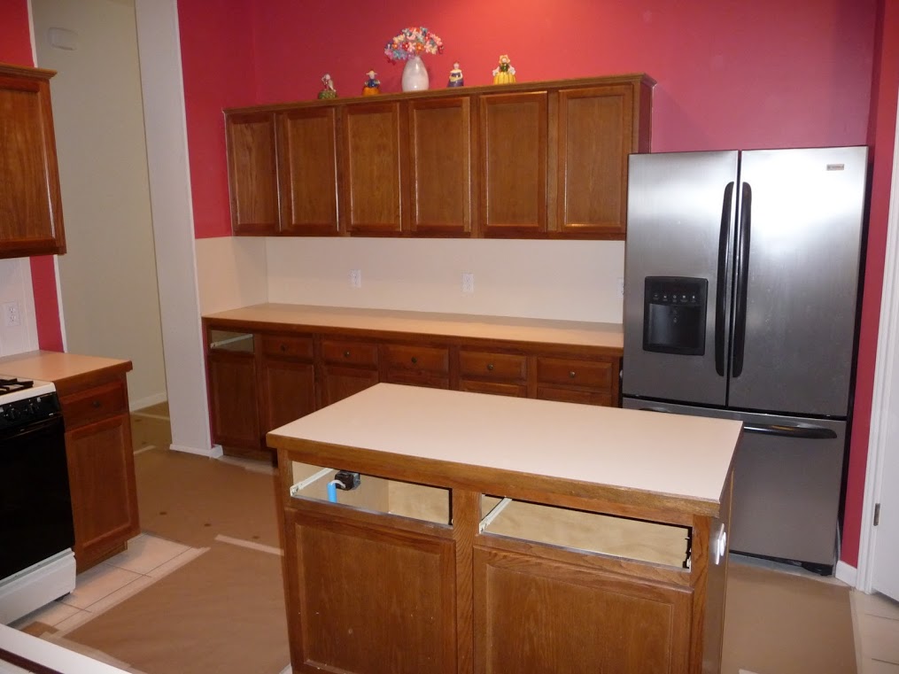
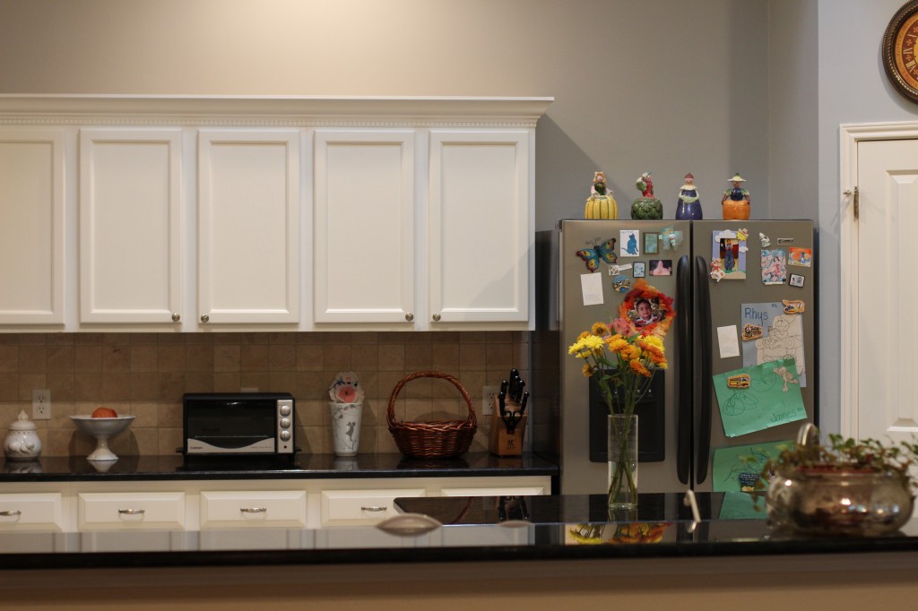
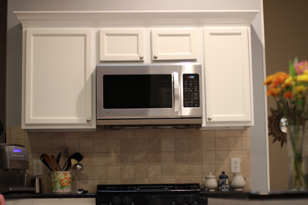
Our kitchen is, both literally and figuratively, the center of our home, and because I spend most of my day here, I wanted it to better reflect my taste and interests. When we first moved in, I chose a pinkish-red color, Martha Stewart’s Bougainvillea for Sherwin-Williams (now discontinued), and I loved it. But after five years, it began to feel closed-in, especially with the original country brown cabinets. I spent many months daydreaming of a lighter, brighter kitchen, and debated the pros and cons of going with white cabinets. It was a huge change, but one I’m thrilled we made, and I think the pictures speak for themselves.
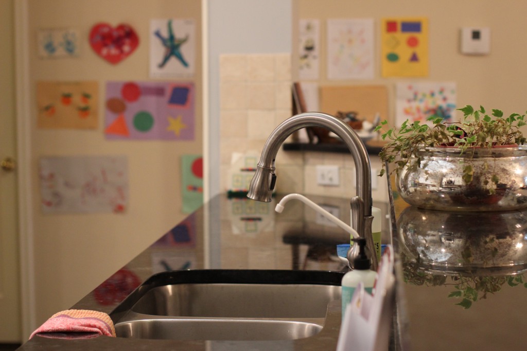
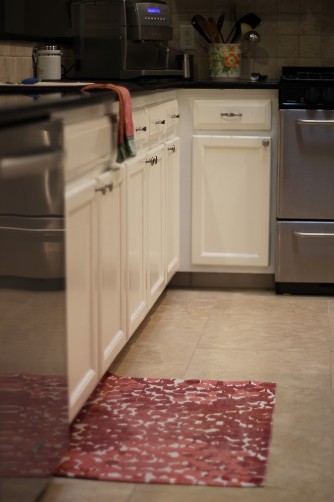
During the renovation, we kept the bones of the original kitchen and simply changed the details. The counters were replaced with Antique Brown granite (a compromise Ryan and I made, since I liked the idea of white counters, too), the old tile was removed and Travertine installed, our kitchen cabinets were painted and a decorative trim was attached to the tops (adding several inches of height), a tumbled marble backsplash was added, and the walls were repainted. Overall, it looks like an entirely new kitchen, but it’s not, and I love that. Everything is still in its original place and works the same as it always did, but things look a whole lot better.
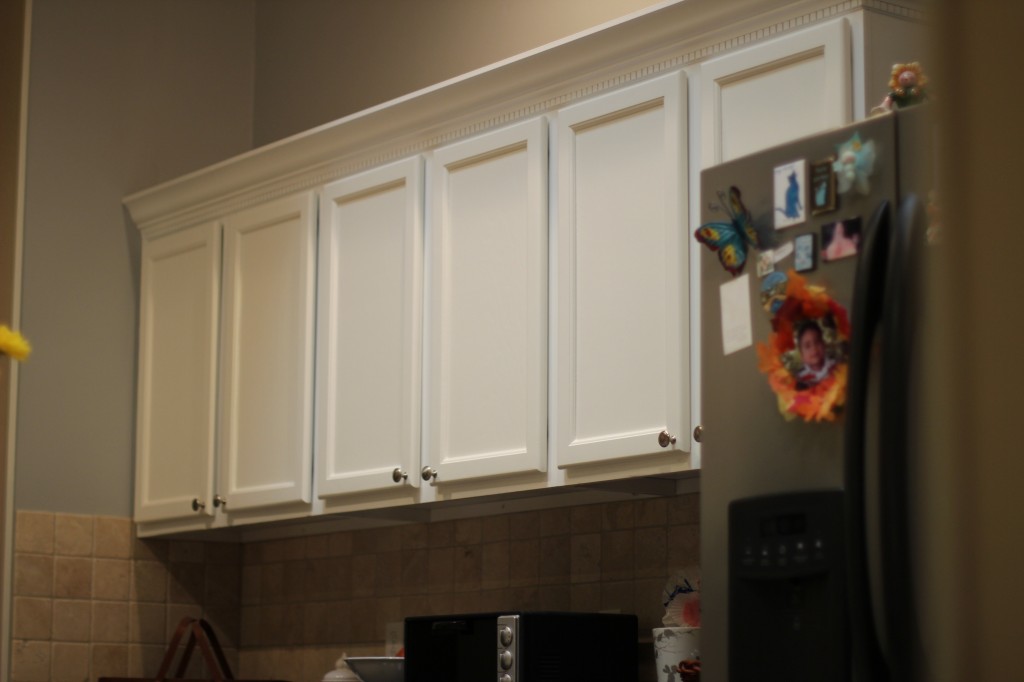
(The cabinets were painted Sherwin-William’s Summer White, and trim was added to the tops. The walls were repainted in Ace Hardware’s Chelsea by the Sea, a soothing gray-blue.)
Most of my inspiration came from drooling over design blogs like Apartment Therapy, Cote de Texas, and my absolute favorite, My Uncommon Slice of Suburbia. If you look closely, you’ll notice lots of similarities between Kristin’s kitchen and mine, and that is not an accident. When I first saw her kitchen as part of a home tour on Apartment Therapy, I fell in love with the style and design. She and her husband have spent years transforming their California home into something phenomenal, and she graciously shares her sources and materials for each project. Thanks to Kristin, I was able to create a very similar look for my new kitchen, using materials that fit within our budget. I also “borrowed” her guest room’s paint color to replace the tired red paint.
I am beyond thrilled to share our kitchen on Kristin’s blog today, and I’m eternally grateful for her knowledge and expertise. Without even knowing it, she helped us transform our home into a quiet and relaxing space for our little family.

It looks so light and modern! I’m starting to drool over home decor these days. 🙂
Thank you, Shayla! Be sure to check out Kristin’s blog for all the dirty details. 🙂
You guys have turned your kitchen into something amazing that your family will enjoy for years to come without breaking the bank! I am so happy that we could be of a bit of inspiration, it always brings joy to know we have helped in a small way.
Enjoy the weekend with your two little guys.
XO
Kristin
Thank you so much, Kristin! Your home is so lovely and continues to inspire me. 🙂
Wow. Your kitchen is beautiful. And probably the size of our kitchen AND living room. I’m mega jealous! I definitely like the change though. It looks much more luxurious, but still homey. 🙂
Ha, well everything is bigger and cheaper in Texas! 🙂
The kitchen looks great – I love the white cabinets. 😉
Thank you so much, Mary Ann!
I love the final result of your kitchen! I couldn’t find the paint “summer white ” thou at shermin williams. 🙁 any suggestions where else can I find it? O a similar at Sherman Williams?!
Thank you, Claudia! Summer White is SW 7557, a standard SW color, so they should have it available. If not, email me and I can give you the recipe to color match it. 🙂
It’s gorgeous!!!! Good job!
Thanks so much, Melek! Hope you are well. 🙂
Ooh Catherine, this is a gorgeous kitchen! So great ‘meeting’ you at the BlogTrends chat and now I have a new blog to follow! 🙂
Thank you, Lisa! It was wonderful meeting you and I’m excited to follow your blog, too. And we both have little ones in common. 🙂
[…] days with increased page views, as Kristin from My Uncommon Slice of Suburbia kindly linked to the accompanying post on my […]
How do you like your Travertine floor? We are thinking of getting the exact same color! Thanks.
Hi Rose! We really like it and it’s been great so far. Since it is lighter in color, you can see stains easily, but they wipe up right away, too. Feel free to email me if you have more questions. 🙂